🎮 Custom Animated Tab Bar driven by Rive Animations
Overview
In this chapter, we'll learn how to build a tab bar that uses animated icons, all managed from a single file. This time around, we'll change artboards and work with a collection of data, iterating over it to trigger the correct animation for each tab.
The Rive asset used in this example comes from the community. You can find it here.
Each artboard includes its own animations and state machine, which enables us to control and trigger animations programmatically.
To start an animation on an artboard, we call the setInput method on the RiveViewModel instance, passing in the input name along with its value.
import RiveRuntime
struct AnimatedTabBarView: View {
let vm = RiveViewModel(
fileName: "animated-icons",
stateMachineName: "State Machine 1",
artboardName: "academic-cap"
)
var body: some View {
HStack {
Button {
vm.setInput("hover", value: true)
} label: {
vm.view()
}
}
}
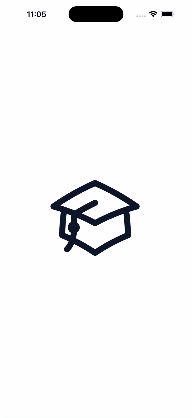
}By default, this makes the animation run continuously. Since that's not the behavior we want, we need a way to stop it.
Here's how we can handle that:
import RiveRuntime

struct AnimatedTabBarView: View {
    [...]

    var body: some View {
        HStack {
            Button {
                vm.setInput("hover", value: true)
                DispatchQueue.main.asyncAfter(deadline: .now() + 1.5) {
                    vm.setInput("hover", value: false)
                }
            } label: {
                vm.view()
            }
        }
    }
}
With this approach, the animation plays for 1.5 seconds and then stops automatically.
Creating the Data Model
At this stage, the main challenge is looping through a list of icons while still being able to customize both the artboard name and the state machine name for each item. To solve this, we need to define a proper data model.
First, we'll create an enum Tabs that represents the available tab selections.
This allows each tab item to be associated with a specific selection state.
enum Tabs: String {
    case lessons
    case archives

    var title: String {
        switch self {
        case .lessons:
            return "Lessons"
        case .archives:
            return "Archives"
        }
    }
}
Next, we'll define a TabItem struct.
This struct must conform to Hashable since it will be used inside a ForEach loop.
struct TabItem: Hashable {
    var vm: RiveViewModel
    var tab: Tabs

    init(vm: RiveViewModel, tab: Tabs) {
        self.vm = vm
        self.tab = tab
    }
}
After that, we'll prepare the data itself.
We'll create an AppViewModel class that stores all the information needed to build the tab bar.
class AppViewModel: ObservableObject {
@Published var tabItems = [
TabItem(
vm: RiveViewModel(
fileName: "animated-icons",
stateMachineName: "State Machine 1",
artboardName: "academic-cap"
),
tab: .lessons
),
TabItem(
vm: RiveViewModel(
fileName: "animated-icons",
stateMachineName: "State Machine 1",
artboardName: "archive-box"
),
tab: .archives
)
]
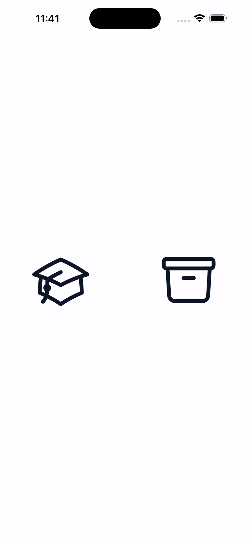
}Once the data is set up, we can loop through it like this:
struct AnimatedTabBarView: View {
    @ObservedObject var vm: AppViewModel = AppViewModel()

    var body: some View {
        HStack {
            ForEach(vm.tabItems, id: \.self) { item in
                Button {
                    item.vm.setInput("hover", value: true)
                    DispatchQueue.main.asyncAfter(deadline: .now() + 1.5) {
                        item.vm.setInput("hover", value: false)
                    }
                } label: {
                    item.vm.view()
                }
            }
        }
    }
}
And here's what the app looks like at this point:
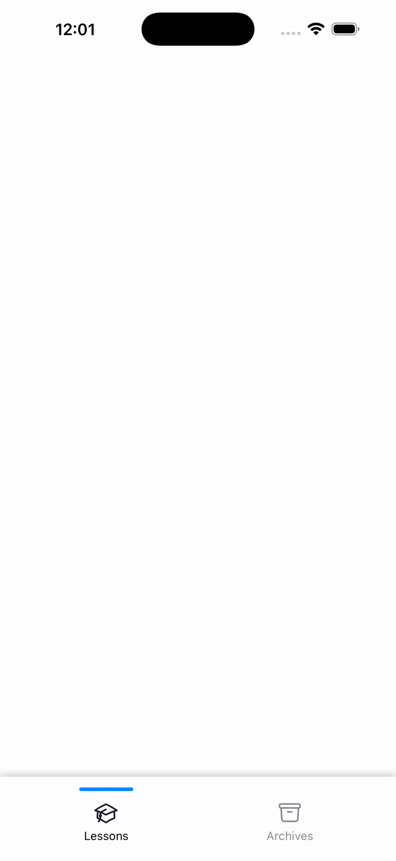
Styling the Tab Bar
Next, we'll enhance the UI by adding a line above the active tab and applying custom styling to indicate which tab is selected.
To do this, we need to keep track of the currently selected tab item. We'll introduce a state variable to store that value.
It's also important to update this state whenever a tab item is tapped.
struct AnimatedTabBarView: View {
    @State var selectedTab: Tabs = .lessons
    @ObservedObject var vm: AppViewModel = AppViewModel()
    [...]

    private func tabItem(for item: TabItem) -> some View {
        VStack {
            if selectedTab == item.tab {
                Capsule()
                    .fill(.blue)
                    .frame(width: 60, height: 4)
                    .offset(y: 12)
                    .zIndex(1)

            } else {
                Color.clear
                    .frame(height: 4)
            }

            Button {
                tapItem(for: item)
            } label: {
                VStack(spacing: 0) {
                    item.vm.view()
                        .frame(height: 56)
                        .opacity(selectedTab == item.tab ? 1.0 : 0.5)
                    Text(item.tab.title)
                        .font(.footnote)
                        .foregroundStyle(selectedTab == item.tab ? .black : .gray)
                        .offset(y: -10)
                }
            }
        }
        .frame(maxWidth: .infinity)
    }

    private func tapItem(for item: TabItem) {
        item.vm.setInput("hover", value: true)
        DispatchQueue.main.asyncAfter(deadline: .now() + 1.5) {
            item.vm.setInput("hover", value: false)
        }
        withAnimation {
            selectedTab = item.tab
        }
    }

    var body: some View {
        VStack {
            Spacer()
                HStack {
                ForEach(vm.tabItems, id: \.self) { item in
                    tabItem(for: item)
                }
            }
            .padding(.horizontal, 20)
            .padding(.bottom, 10)
            .background(Color(.systemBackground).shadow(radius: 5))
            .background(.ultraThinMaterial)
        }
        .edgesIgnoringSafeArea(.bottom)
    }
}
Here's the resulting design:
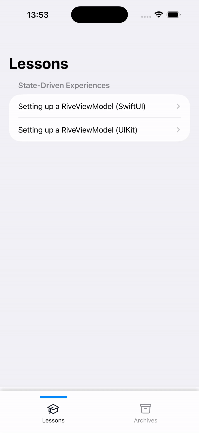
Updating the Main Content Based on the Selected Tab
Now we need to handle switching the main content when a tab is selected. To achieve this, we'll refactor the code slightly and move some variables up to the root view so the selected tab can be accessed globally.
With this setup, we can dynamically change the displayed content depending on the active tab.
struct AppView: View {
    @ObservedObject var vm: AppViewModel = AppViewModel()
    @Namespace private var animation
    @State private var selectedTab: Tabs = .lessons

    var body: some View {
        VStack {
            // main content area
            Group {
                switch selectedTab {
                case .lessons:
                    LessonsView()
                case .archives:
                    ArchivesView()
                }
            }
            .frame(maxWidth: .infinity, maxHeight: .infinity)

            // animated tab bar
            AnimatedTabBarView(
                selectedTab: $selectedTab,
                tabItems: vm.tabItems,
                animation: animation
            )
        }
        .edgesIgnoringSafeArea(.bottom)
    }
}
Because of these changes, we also need to update the AnimatedTabBarView accordingly.
struct AnimatedTabBarView: View {
    @Binding var selectedTab: Tabs
    var tabItems: [TabItem]
    var animation: Namespace.ID

    var body: some View {
        HStack {
            ForEach(tabItems, id: \.self) { item in
                tabItem(for: item)
            }
        }
        .padding(.horizontal, 20)
        .padding(.bottom, 10)
        .background(Color(.systemBackground).shadow(radius: 5))
        .background(.ultraThinMaterial)
    }

    [...]
}
Finally, here's a preview of how the app for this version looks:
In case you are interested in the source code, feel free to check out the repository.
🤝 Wrapping Up
This chapter wraps part 2 of the series. I hope this guide has helped you feel more at ease and confident when using Rive in your own applications.
In the next edition, we'll begin part 3 and dive into topics such as displaying dynamic content, adding multi-language support to Rive animations, and managing assets effectively. Stay tuned!